ExeOutput for PHP includes a visual editor that lets you create modern and complex user interfaces for your PHP applications. To edit your application’s interface, go to Application Settings => Components.
You will see two lists, Available Components and Components Used, with a Properties Editor on the right side.
Components Used #
This list contains all of the customizable user interface components:

The following components are available by default and cannot be removed. Please see their corresponding topics for more help:
Other optional components include:
You can add multiple toolbars if you wish; there is no hard-coded limit.
Each component has its own properties, which can be configured with the Properties Editor. To edit a component’s properties, select it in the list.
Info
Some components have an Edit button that opens the associated UI editor.
Adding a UI Component #
You can add new UI components to your application. These components will make up your application’s main window interface.
Available components include the Menu Bar, Toolbar, and Ribbon. Select the desired component type from the Available Components list and click Add Component.
Each UI component has a name defined in the Components Used list. When you add a component, you are prompted for a name. This name is an important identifier used for manipulating the UI programmatically.
Editing Component Properties #
The Properties Editor lets you modify the properties of the selected component. It works similarly to the one found in Paquet Builder. If you are unfamiliar with this grid editor, a brief description of how it works is provided below.
Warning
All changes are saved automatically.
Modifying UI Components and Controls at Runtime #
ExeOutput for PHP supports changing control properties at runtime.
Refer to the dedicated topic “How To Modify Controls At Runtime“.
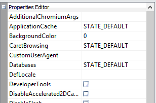
How the Properties Editor Works #
The Properties Editor enables you to set properties for the selected component, which defines its state.
- The first column lists property names. A plus sign (+) indicates sub-properties that can be expanded. A minus sign (-) collapses them. You can also use the
+and-keys. - The second column displays property values. When a property is selected, you can type a new value.
- A small button (…) appears for properties that can be set using a dialog.
- A drop-down arrow appears for properties with a predefined list of values (enumerated types).


