User Interface - Components
ExeOutput for PHP lets you create modern and complex user interfaces for your PHP applications with its visual editor. To edit the interface of your application, go to Application Settings => Components.
You have two lists named Available Components, Components Used, and a properties editor on the right side.
Components Used
This list contains all of the components of the user interface that can be customized:
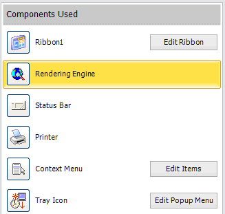
The following components are available by default and can't be removed. Please refer to the corresponding topic for further help:
Other components that can optionally be added are:
Of course, you can add several toolbars if you prefer. There is no hard-coded limit.
Each component has its own properties and can be configured with the properties editor. To edit the properties of a component, just select it in the list.
Info
Some components have an Edit button to open the associated UI editor.
Add a UI component
You can add new UI components to your application. These components will compose the application main window's interface.
Available components are menu bar, tool bar, and ribbon component. Select the type of component you want in the Available Components list and click Add Component.
Each UI component has a name defined in the "Components Used" list. When you add a component to the UI, you are prompted for the name. This name is important because it is used as an identifier for manipulating the UI programmatically.
Edit component properties
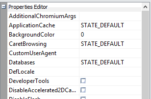
The properties editor lets you modify the properties of the selected component: it works like the one you can find in Paquet Builder. If you are not familiar with this grid editor, see below for a brief description of how it works.
Warning
All changes made are directly saved!
Modify UI components and controls at runtime
ExeOutput for PHP supports changing control properties at runtime.
Refer to the dedicated topic "How To Modify Controls At Runtime".
How does the Properties Editor work?
The Properties Editor enables you to set properties for the selected component. By setting properties, you are defining the state of a component. If the properties are arranged by name, the first column lists the names of the selected action's properties: If a plus sign (+) appears beside a property name, this can be clicked to display the sub-properties of that property. These can be a list of possible values when the property represents a set of flags, or sub-properties if the property represents an object (the value column gives the name of the object, enclosed in parentheses). Similarly, if a minus sign (-) appears, this can be clicked to collapse the sub-properties. When a property has focus, you can also use the keyboard + and - keys to expand or collapse properties.
The second column displays the property values: When the property is selected, the value changes to an edit control where you can type a new value. If the value can be set using a dialog, a small button appears when the property is selected. Click this button to display a dialog where you can set the property.
If the value is an enumerated type, a drop-down button appears when the property is selected. Click this button to display a drop-down list that you can use to set the property.